
A CRM dashboard is a single screen that turns the records in your CRM into the handful of numbers someone needs to make a decision today. Not a report you read once a quarter — a live view of pipeline, activity and outcomes, filtered to one person’s responsibility. A good one answers a question in under thirty seconds.
What a CRM dashboard is
Every CRM stores far more than anyone can read. A dashboard is the answer to that problem: a configurable screen of charts, counters and lists, built from live records, that shows the state of the business at a glance and updates itself.
The important word is decision. A dashboard is not a summary of everything the CRM knows; it is the subset that changes what somebody does this week. That framing is what separates the dashboards people open every morning from the ones that get bookmarked once and never revisited.
It is also worth knowing that dashboards are a studied design problem, not just a feature. A 2022 review of 144 real dashboards by Bach and colleagues, published in IEEE Transactions on Visualization and Computer Graphics, identified recurring design patterns and — usefully for anyone building one — the trade-offs those patterns force between showing detail and staying readable. The practical lesson is that most dashboard problems are composition problems, not data problems.
The four zones of a working dashboard
Strip the branding off any CRM dashboard that people genuinely use and the same four zones appear.
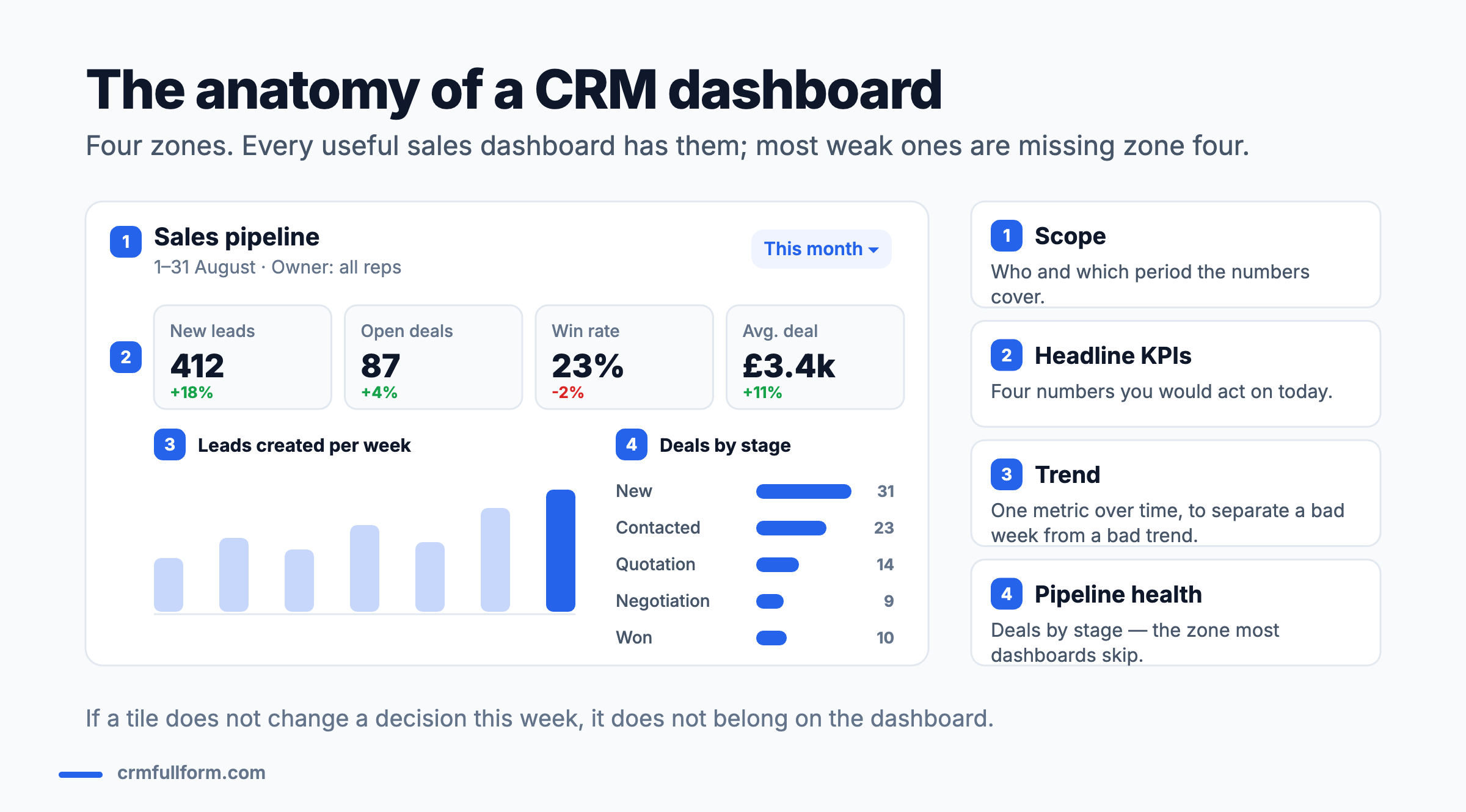
Zone 1 — Scope
Who and what period the numbers cover, stated plainly at the top. “1–31 August, all reps” is not decoration. Without it, every figure below is ambiguous and two people will read the same screen differently — which is how dashboard arguments start.
Zone 2 — Headline KPIs
Three to five numbers, each with a comparison against the previous period. The comparison is what makes a number actionable: 412 new leads means nothing on its own; 412, up 18%, means something. Resist the urge to add a sixth tile.
Zone 3 — Trend
One metric over time. This exists to stop a single bad week being mistaken for a bad trend, which is the most common misreading in any sales meeting.
Zone 4 — Pipeline health
Deals broken down by pipeline stage, with counts and values. This is the zone most templates leave out and the one managers actually need, because it shows where deals are accumulating and therefore where the process is jamming.
Which metrics belong to which role
The most common cause of an ignored dashboard is showing everyone the same one. A rep and a finance director need different screens built from the same data.
| Role | What they need to decide | Metrics that earn a tile |
|---|---|---|
| Sales rep | What do I do in the next two hours? | My overdue tasks, my deals with no activity in 7 days, my deals closing this month |
| Sales manager | Where is the process jamming? | Deals by stage, stage conversion rates, average time in stage, reps below activity threshold |
| Marketing | Which channel deserves more budget? | Leads by source, source-to-customer conversion, cost per qualified lead, campaign attribution |
| Customer service | Are we keeping promises? | Open tickets by age, first-response time, first-contact resolution, tickets reopened |
| Executive | Are we going to hit the number? | Weighted pipeline vs target, forecast vs actual, revenue by segment, churn |
Notice how few of these overlap. If your CRM only supports one dashboard for everyone, build it for the manager and let individuals use filtered list views instead.
The metrics worth removing
Removing tiles improves dashboards more reliably than adding them. These are the usual candidates:
- Total contacts in the database. Goes up forever, changes no decision, and quietly rewards importing rubbish.
- Total emails sent. An activity count with no outcome attached. Easy to game, and it will be gamed.
- Lifetime revenue on a weekly dashboard. Correct, impressive and irrelevant to this week.
- Any tile nobody can name a threshold for. If you cannot say what number would worry you, you are not monitoring it.
- Vanity conversion rates with no denominator shown. “42% conversion” from what, out of how many?
A blunt test that works: for each tile, ask what you would do differently if it moved by 20% overnight. Silence means delete.
Six mistakes that make dashboards useless
- Building on dirty data. A dashboard sitting on stale deals produces a confident, wrong forecast. Fix the CRM database first; the dashboard will expose the mess anyway.
- Too many tiles. Past roughly seven, people stop reading and start scanning for the one number they already care about.
- No comparison period. A number without a baseline cannot be judged, only reacted to.
- Mixing time ranges silently. One tile showing this month next to one showing the last 90 days, with no labels, is how two departments end up with different “truths”.
- Charts that need explaining. If a chart requires a caption to be understood, a table would have been better.
- Nobody owns it. Dashboards decay as the business changes. Someone has to review them quarterly — usually the CRM manager.
Building one in thirty minutes
Every mainstream CRM builds dashboards the same way: create a report, then pin it as a component. The order matters more than the software.
- Write the question first. One sentence, on paper: “Are we creating enough qualified pipeline to hit next quarter?” Dashboards built without a question become collections of charts.
- Name the audience and the cadence. Who opens it, and how often? Daily and quarterly dashboards look nothing alike.
- Pick four KPIs, not eight. Each with a comparison to the previous period.
- Add one trend chart. The single metric that best represents the question.
- Add the stage breakdown. Counts and values by pipeline stage.
- Set the filter and save it. Owner, date range and record type, saved as the default so nobody has to re-apply it.
- Delete something. There is always one tile that was added because it was easy rather than because it was useful.
If the data is not there yet, the problem is upstream: how CRM works covers the record-keeping habits a dashboard depends on, and features of CRM covers what reporting tools each system gives you.
Dashboard vs report vs forecast
These three words get used interchangeably and mean quite different things.
| What it is | How often you look | Answers | |
|---|---|---|---|
| Dashboard | A live screen of several components | Daily or weekly | What is happening right now? |
| Report | One detailed, filterable table or chart | When you have a question | Why is that number what it is? |
| Forecast | A projection from weighted pipeline | Weekly or monthly | What is likely to happen next? |
A dashboard usually contains small reports; a forecast is usually one component on a dashboard. If you are being asked for “a dashboard” but the real request is a one-off answer, build a report and save everyone the maintenance.
Frequently asked questions
What is a CRM dashboard?
A CRM dashboard is a single configurable screen that turns live CRM records into a small set of numbers, charts and lists. It typically shows the scope of the data, three to five headline KPIs with comparisons to a previous period, one trend chart, and a breakdown of deals by pipeline stage, so that someone can judge the state of the business in seconds.
What does CRM stand for?
CRM stands for customer relationship management. It describes both the practice of managing interactions with customers and prospects, and the software used to do it. Our CRM full form page covers the term in detail, including the different meanings CRM has in medicine, banking and engineering.
What metrics should be on a CRM dashboard?
It depends on who is looking. A sales manager needs deals by stage, stage conversion rates and average time in stage. Marketing needs leads by source and source-to-customer conversion. A service team needs open tickets by age and first-contact resolution. A useful rule: if you cannot say what number would worry you, the metric does not belong on the dashboard.
Is Excel considered a CRM?
No. Excel can display CRM-style metrics and many teams build dashboards in it, but it does not link record types automatically, keep an interaction history or prompt anyone to act. It works as a reporting layer on exported CRM data; it does not replace the system that captures that data in the first place.
How many charts should a CRM dashboard have?
Most people stop reading past about seven components. Four KPI tiles, one trend chart and one stage breakdown is a good default. If a new component is genuinely needed, the honest move is usually to remove an existing one rather than add a row.
Related pages
- CRM full form — what customer relationship management means
- What is a CRM database? — where dashboard numbers come from
- How CRM works — the process behind the metrics
- CRM process — the pipeline stages a dashboard reports on
- What is a CRM manager? — who normally owns the dashboards
- Best CRM software — reporting strength by platform